A Beginners Guide to Kerning.

Imagine the awful, awkward feeling that you get when you are riding the subway during rush hour. People have filled the subway car and are invading your personal space. A little too close for comfort. Well, we are not the only ones who need just the right amount of space around us to be comfortable. This also applies to the characters in the words we read everyday, and is much more important than you might think.
When reading text, our eyes don’t actually process the shape of each character, but the negative space that surrounds it. This is why it is important for this space to be evenly distributed. Not only does this give the text a more polished look, but is more comfortable on the readers eyes, as it creates a consistent rhythm, increasing legibility. If this rhythm is broken, the readers’ eyes struggle to decipher the shapes, which now have an inconsistent structure, causing a negative experience for the reader. This is especially important in headlines, where bad spacing is that much more evident.

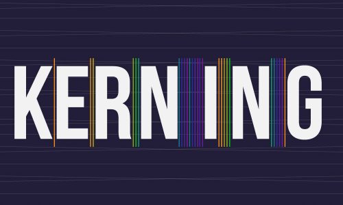
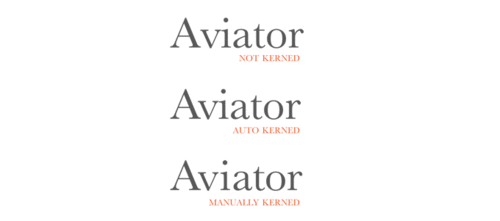
The practice of adjusting the space between the individual letterforms is referred to as kerning. Kerning can be a tricky task, due to the varying shapes of the characters, but can be successfully achieved by a professionally trained designer. In a well-kerned font, the spaces between each letterform will have a similar surface area. Most well-designed fonts have kerning that has been built in, to a certain degree, by the font designer. Additional kerning adjustments will need to be made, however, as all letterform combinations cannot be anticipated by the font designer.
Although subtle details, such as kerning, are not normally in the front of a client’s mind when having a project designed, it is these small details that separate good design from poor design. The objective of design is to communicate a message and create an experience for the viewer. Often, the less obvious elements are those that generate the most positive experience, and ensure the message resonates effectively with the audience. As in all good design, such as architecture, it is essential to begin with a strong structure, which will support the aesthetic.

This is the kind of quality you can always expect from the creative team at BANG! creative.
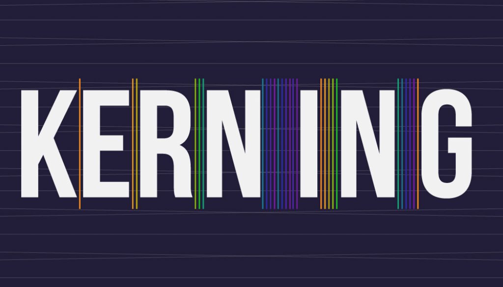
So remember… what is keming? bad kerning.


